
Is your beauty salon website design looking a bit old-fashioned? Boring? Or even messy? The good news is – we have some easy tips and tricks to help you create impressive salon web design. Even better, you don’t have to be a web designer to create an astonishing website anymore. With the help of the right tools all you’ll need is time, planning, good content and visually appealing images.
Want to learn more website design tips?
Keep on reading to find out more.
Getting Started
When it comes to salon web design, most people have no idea where to start. Should they hire a website developer? Or use the services of website development tools such as Wix? There are pros and cons of each method – one allows you to practice your creativity, yet requires your time, while the other is often quite expensive but saves you time.
Regardless of your method of choice, there often comes a time where you begin to ask yourself - what template should I choose?
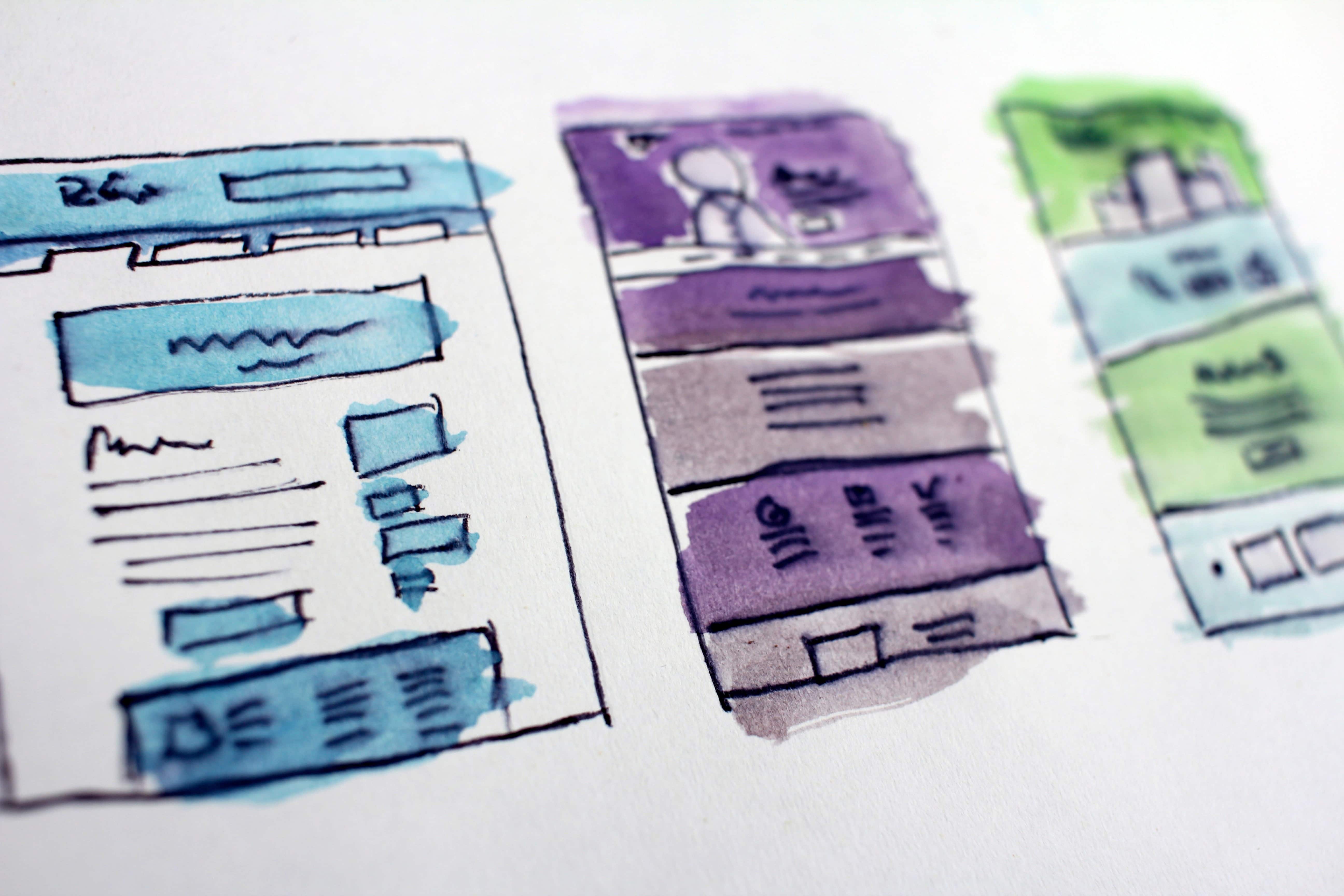
A good place to start with your salon web design template is to consider the aesthetics, colours and branding of your beauty salon, as well as your target audience. For example – if your salon is girly and pink then a minimalist dark template will most likely not fit you well.
Content
As the name entails, the keyword in beauty salons is … beauty. Which is why it is very important to incorporate it into your salon website design – whether it is interactive images, animation, gifs, banners or professional, gorgeous images, every website design detail must demonstrate ‘beauty’. Think of your website as your virtual salon door – if it doesn’t reflect your style, class and the quality of your services and your customers then people won’t come in.
Consider incorporating:
- Professional high quality salon shots
- Before-and-after makeover shots
- Location shots – to show off your amazing business
Structure
Structuring your website in such way that all of the important information is clearly visible at the top and people don’t end up spending time looking for it is crucial! Make sure that the top of your page includes:
- Opening hours
- Contact information
- Booking button
Also don’t forget to:
- List the services you offer and post an online price list.
- Include links to your relevant social media channels.
PDF Topic: "How to Get the User's Attention"
Going Mobile
No matter how good your salon website design is, if is not mobile friendly then your website risks losing a huge part of the potential clients. In line with the latest website design trends, websites are now designed to automatically scale to any device ensure that clients and prospects will find you no matter how they’re surfing. Experts now propose a mobile-first strategy—meaning that they design sites first for optimal viewing on a smartphone.
Final Tips
One rule to live by – always change, expand, learn. Your salon website should be no difference. As technology, SEO tactics, Google and businesses change on a daily basis, so should your beauty salon website reflect this ever changing situation. Remember to enhance, tweak and promote your salon website regularly In order to match the latest website design tendencies.


